
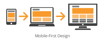
In today’s fast-paced digital world, customers are more likely to interact with your business on a smartphone than on a desktop. In fact, mobile devices account for over 60% of global website traffic in 2025. This shift has changed how websites and apps should be built, making mobile-first development not just an option, but a necessity for businesses that want to stay competitive.
At SparkCreate Solutions, we believe mobile-first is the future of digital experiences. Here’s why your business can’t afford to ignore it.
What is Mobile-First Development?
Mobile-first development is a design and development approach where the mobile version of a website or application is prioritized before scaling up to larger screens (like desktops or tablets). Instead of shrinking a desktop site down to fit a phone, the design starts with mobile — ensuring it is fast, functional, and user-friendly.
Why Mobile-First Matters in 2025
1. Most Users Are Mobile-First Themselves
Your customers are already browsing, shopping, and engaging from their smartphones. If your site isn’t optimized for mobile, you’re losing leads, sales, and credibility.
2. Google Prioritizes Mobile-Friendly Sites
Search engines now use mobile-first indexing, meaning Google primarily looks at the mobile version of your website to determine your rankings. A poorly optimized mobile site = lower SEO visibility.
3. Better User Experience = Higher Conversions
Mobile-first development focuses on speed, simple navigation, and responsive layouts. This reduces bounce rates and increases conversions — whether that’s buying a product, booking a service, or filling out a form.
4. Future-Proof and Scalable
By starting with mobile, your business builds a solid foundation for scalability. It’s easier to expand a mobile-friendly design to larger screens than the other way around.
Mobile-First Best Practices
- Simplify navigation – Use clear menus and intuitive layouts.
- Prioritize speed – Optimize images and reduce unnecessary code.
- Responsive design – Ensure content looks great on all devices.
- Touch-friendly UI – Buttons and links should be easy to tap.
- Content hierarchy – Place the most important information first.
Also Read: Top 10 Mistakes That Make Your Website Slow — And How to Fix Them
Why Partner with SparkCreate Solutions?
At SparkCreate Solutions, we specialize in mobile-first, responsive, and scalable web development. Our Agile full-stack teams ensure that your digital solution is not only modern and functional but also future-proof and sustainable.
Whether you’re a startup, small business, or enterprise, we’ll help you design digital experiences that convert on every device.
Final Thoughts
Mobile-first development is no longer a trend — it’s the standard for success in 2025. Businesses that adapt will enjoy higher visibility, stronger engagement, and better growth opportunities. Those that ignore it risk being left behind.
👉 Ready to take your business mobile-first? Contact Us today and let’s build the future of your digital presence together.